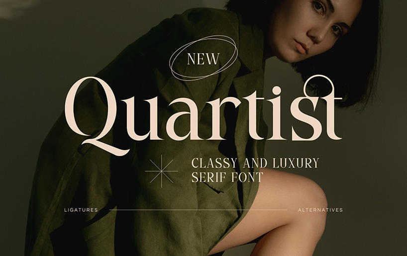
Quartist: A Versatile Serif Font for Modern Design
Typography plays a silent yet powerful role in communication. While images can attract attention instantly, the font choice shapes how the message is perceived. Among the many typefaces available today, Quartist stands out as a serif font that balances elegance, clarity, and adaptability. It is not just a decorative choice—it is a design tool that can be used across diverse creative needs.
Understanding the Essence of Quartist
Quartist is more than just a set of letters. Its design combines traditional serif characteristics with a modern touch, making it suitable for multiple purposes. Each curve, stroke, and serif is shaped with intention, resulting in a typeface that feels both familiar and refreshing.
While some serif fonts are tied to a formal or historical aesthetic, Quartist is flexible enough to fit into contemporary contexts without losing its sophistication. This unique balance makes it an appealing choice for designers who want their work to feel approachable yet refined.
Why Serif Fonts Still Matter in a Digital Age
In an era dominated by sans-serif fonts in apps, websites, and digital branding, serif typefaces hold a timeless charm. They carry visual cues that signal tradition, trust, and authority—qualities that can be essential for certain brands or publications.
Quartist takes these strengths and reshapes them for modern usage. It maintains the subtle weight distribution and stroke variations of a serif while introducing smoother transitions and open letterforms, ensuring legibility across screen sizes and print formats.
The Calm yet Impactful Personality of Quartist
Quartist’s design has a unique personality. At first glance, it gives a relaxed and calm impression—something that feels warm and welcoming to the reader. Yet, underneath this gentle appearance lies a strong ability to convey clear and impactful messages.
This balance is achieved through its proportions and spacing. The font is neither overly condensed nor too loose, allowing it to breathe without feeling scattered. The result is a reading experience that feels natural, which is why it works well in both short and long text formats.
Multipurpose Applications of Quartist
One of Quartist’s biggest strengths is its multipurpose usability. Designers do not need to limit it to a single context—it adapts easily to various uses, including:
1. Display Text
In titles, headings, and posters, Quartist captures attention with its distinctive serifs and balanced structure. It can be bold and assertive without becoming overwhelming.
2. Body Text
Some serif fonts struggle in long passages, but Quartist’s smooth curves and moderate contrast make it comfortable for continuous reading. It keeps the reader engaged without straining the eyes.
3. Branding and Logos
Quartist can shape a brand’s personality. Whether for a luxury brand aiming for sophistication or a creative agency seeking a unique signature, its design communicates professionalism with character.
4. Editorial and Print Design
Magazines, brochures, and books benefit from Quartist’s legibility and aesthetic harmony. Its ability to maintain clarity in different sizes is a major advantage for print layouts.
Technical Qualities That Enhance Design
Quartist is not only visually appealing but also thoughtfully constructed. Its kerning is optimized for consistency, and its letterforms have a well-balanced contrast between thick and thin strokes. These qualities give it both style and functionality.
The font also handles digital rendering gracefully. On high-resolution screens, every curve remains crisp. On lower-resolution displays, it retains enough clarity to avoid distortion, making it practical for web use.
How Quartist Influences Brand Perception
Fonts shape how people feel about a brand before they even read the words. A brand using Quartist communicates qualities such as:
- Reliability – The classic serif form builds trust.
- Calm Confidence – Its relaxed vibe suggests stability without arrogance.
- Attention to Detail – The precise design reflects careful craftsmanship.
By choosing Quartist, brands subtly position themselves as thoughtful and trustworthy, while still appearing fresh and relevant.
Pairing Quartist with Other Fonts
Quartist pairs beautifully with minimal sans-serif fonts. Using it for headings alongside a clean sans-serif for body text can create a balanced visual hierarchy. For more artistic projects, pairing it with a script font can add elegance and flair.
The key is contrast—Quartist’s character-rich forms stand out best when complemented by a simpler partner font.
Tips for Using Quartist Effectively
- Mind the Size – In smaller sizes, use regular weight for clarity; in large display formats, try bold or semi-bold for emphasis.
- Balance White Space – Its moderate spacing allows flexibility, but adding ample margins around text enhances its calming feel.
- Consider the Medium – Use slightly darker colors for screen text to maximize legibility.
- Match Tone with Content – Pair Quartist with content that aligns with its personality—professional, creative, and refined.
The Future of Quartist in Modern Design
Trends in typography often shift quickly, but some designs maintain relevance for decades. Quartist has the qualities needed for longevity—adaptability, visual appeal, and functional clarity. As brands increasingly look for fonts that can work across both print and digital spaces, Quartist is likely to remain a go-to choice.
Designers value tools that allow them to work efficiently without compromising quality. Quartist fits this role perfectly—it’s versatile, dependable, and capable of delivering the right emotional tone.
Final Thoughts
Quartist is more than just a serif font; it is a design asset that can elevate the quality of both visual and written communication. Its calming presence, combined with the ability to deliver strong messages, makes it suitable for a wide range of applications—from high-impact branding to serene editorial layouts.
For anyone seeking a typeface that blends tradition with modern sensibility, Quartist offers the perfect balance. Whether you are designing a brand identity, crafting a publication, or building a website, this font has the versatility to meet your needs while leaving a lasting impression.


